| Letter from the Director I write to announce that the David Winton Bell Gallery will remain closed until at least January 2021. While we are disappointed that we will not be able to present exhibitions this fall, we are taking this action in accordance with Brown University guidelines and out of concern for the health of our community, including our presenting artists, our faculty, students, and staff, and you, our public. During this time, we will focus on our collection — completing a condition survey of the collection, digitizing artwork in the collection and exhibition records, and sharing our recent acquisitions, which continue to focus on works made by Black, Indigenous, and people of color (watch for Collection Highlight announcements). We will also be planning for the landmark 50th Anniversary of Bell Gallery in the fall of 2021. We look forward to celebrating with you then! Technology cannot replace the experience of viewing art in the original. However, during this period, we will do our best to present virtual programming that is enlightening, informative, and meaningful. We look forward to the upcoming release of our online exhibition — Raymond Hood and the American Skyscraper. Curated by Professor Dietrich Neumann and PhD candidate Jonathan Duval, the exhibition was scheduled to open last spring; it has been handsomely transformed into a digital presentation by our colleagues at Brown’s Center for Digital Scholarship. Finally, we welcome requests for in-person appointments from Brown University faculty and students who are authorized to be on campus this fall and need access to the collections for research and teaching. These requests will be subject to Gallery approval and will be limited in number. In this rapidly changing situation, we encourage you to visit the Gallery’s website and social media for updates. I hope that you are well and finding means to create calm and joy during this troubling time. Thank you for your patience and support. Jo-Ann Conklin Director |
Author Archives: David Winton Bell Gallery
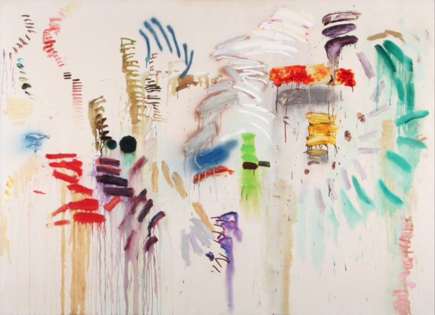
Spotlight: Mel Bochner’s “Glacier”
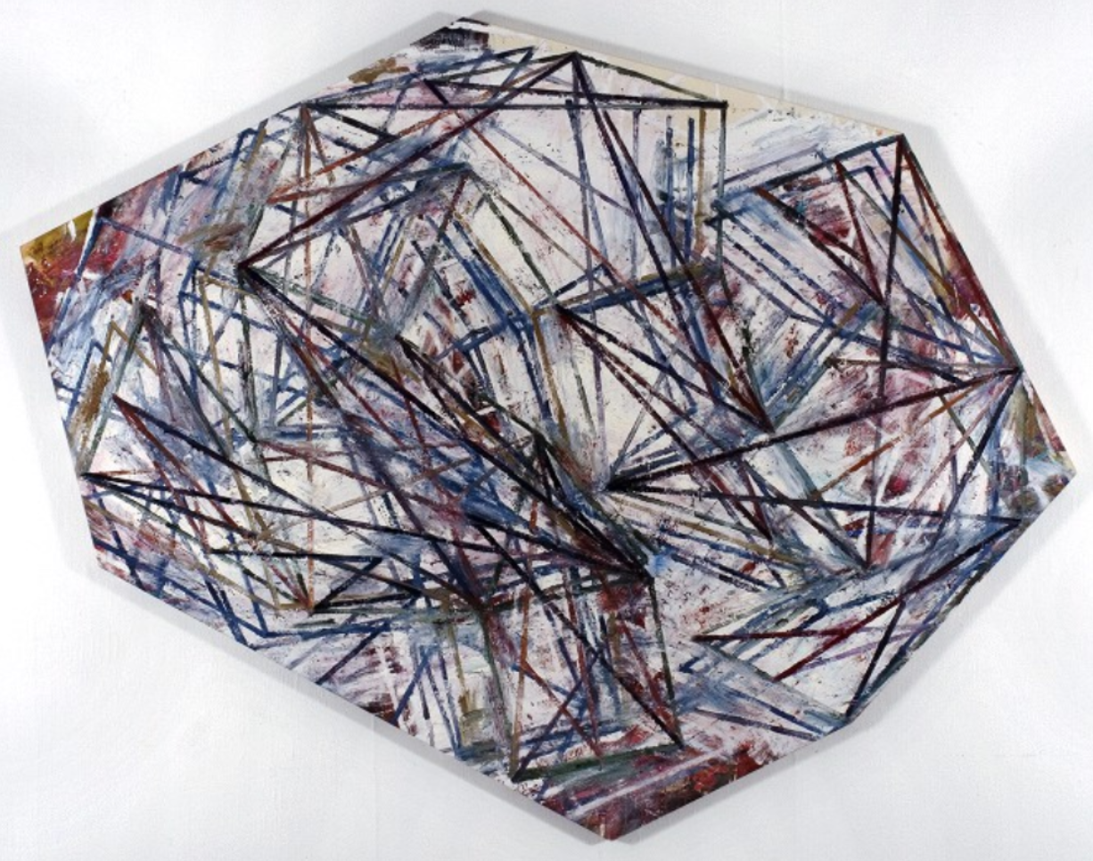
Mel Bochner
American, born 1940
Glacier, 1983
Oil on canvas, 93 x 119.5
Gift of Mr. and Mrs. Ronald F. Ostrow
When you paint a glacier, you might start by dipping your brush in white paint to capture its translucent qualities. You might then add hints of blues for depth, and some yellow to reflect the sun’s rays glowing off of the frozen surface. Mel Bochner’s Glacier, in contrast, uses dazzling red, mauve, plum, ocher, teal, forest green, and seemingly every other color on the palette (along with white) to render his asymmetrical, fractal vision of a glacier. It’s not so much a single glacier that he’s painted, but rather, it seems as though all of the potential views of a glacier at all different angles are being portrayed at once.
That level of complexity is fitting for Bochner, who is known as one of the United States’ most prominent conceptualist artists. He is also a celebrated critical and theoretical writer who dissects the use of language in works of art. His background and training were experiences in duality: while studying at the Carnegie Institute of Technology (now Carnegie Mellon University), Bochner balanced learning diametrically-opposed ways of developing an artistic practice from modernist and academic drawing teachers Douglas Wilson and Wilfred Readio, respectively. Of his training, Bochner has remarked: “I think, in some way, my work has always been about figuring out how to reconcile those two contradictory ideas of being an artist.”[1]
Bochner graduated from Carnegie in 1962, and arrived in New York in 1964 to teach at the School of Visual Arts. During this time, he developed connections with some of the most cutting-edge contemporary artists of that era, including Clyfford Still, Donald Judd, Dan Flavin, and John Cage. Bochner reached prominence with his 1966 exhibition Working Drawings and Other Visible Things on Paper Not Necessarily Meant To Be Viewed as Art, in which he placed photocopies of notes and scribbles by Judd, Flavin, and Cage, among others, on pedestals. Both a reflection of idiosyncratic techniques and the result of an insufficient budget,[2] this playful and unexpected display came as a stark contrast to the popular Abstract Expressionism of the 1960s. Critics and art historians have called Working Drawings the first-ever conceptual art exhibition.[3]
Within his artistic practice, Bochner is primarily known for his “Thesaurus Paintings” series. These works feature lists of synonyms painted on a canvas; for example, the 2013 work “Self/Portrait” also contains the words “Ego Portrayal,” “Selfhood Representation,” and “Oneness Delineation,” in thinly-applied white paint on a black ground. [4] The “Thesaurus Paintings” probe our use of language, how ideas connect to the words we choose, and the distinction between who is speaking and who is being spoken to. Bochner pushed his vision of the interplay between word and image further with his 1970 installation “Language is Not Transparent,” which was grounded in his skepticism of the viewer’s ability to decipher the artist’s mindset by reading into word usage. Bochner has commented that “my feeling was that there were ways of extending, or re-inventing visual experience, but that it was very important that it remain visual. The viewer should enter the idea through a visual or phenomenological experience rather than simply reading it.”
Bochner is represented in the collections of the Museum of Modern Art, the Los Angeles County Museum of Art, and the Whitney Museum of American Art, among others.
-Deborah Krieger, Public Humanities MA ’21
[1]https://brooklynrail.org/2006/05/art/in-conversation-mel-bochner-with-phong-bui
[2]https://brooklynrail.org/2006/05/art/in-conversation-mel-bochner-with-phong-bui
[3]https://www.nytimes.com/2019/11/26/t-magazine/mel-bochner.html
[4]https://www.newyorker.com/culture/culture-desk/mel-bochners-thesaurus-paintings
Bibliography and Further Reading:
Altman, Anna. “Mel Bochner’s Thesaurus Paintings.” The New Yorker, June 17, 2014. https://www.newyorker.com/culture/culture-desk/mel-bochners-thesaurus-paintings
Bui, Phong. “Mel Bochner with Phong Bui.” Interview with Mel Bochner. Brooklyn Rail, May 2006. https://brooklynrail.org/2006/05/art/in-conversation-mel-bochner-with-phong-bui
Lakin, Max. “A Conceptual Art Pioneer Who Doesn’t Mince Words.” The New York Times Style Magazine, November 26, 2019. https://www.nytimes.com/2019/11/26/t-magazine/mel-bochner.html
“Mel Bochner.” Simon Lee Gallery. https://www.simonleegallery.com/artists/mel-bochner/
“Mel Bochner.” Maddox Gallery. https://maddoxgallery.com/artists/mel-bochner/
“Mel Bochner Biography.” Masterworks Fine Art. https://www.masterworksfineart.com/artists/mel-bochner/biography
Students Respond: “Horse II”
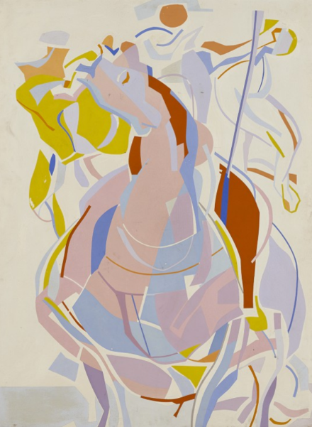
Carl Robert Holty
Horse II, 1945
Oil on masonite, 53 x 39.5
Gift of The Albert A. List Family Collection
Carl Robert Holty’s Horse II (1945) first caught my eye because of the great sense of motion. The horse moves out of the canvas with its head tilted and its body fragmented into a smattering of shapes. The figures on its back blur into a yellow-blue flame, their orange faces augmented in the chaos. The horse is full of seeming dichotomies, walking the line of muscle and fleshiness. The shapes that carve out his body are of gentle pinks, purples and blues while they inherit harshness from their forms reminiscent of collage or woodcuts.
At this moment I am staying with my grandmother and revisiting photographs of when she came to the United States in 1946 as a German-speaking refugee. Holty himself was an immigrant from Germany decades before. The central figure wears a tri-corner hat nodding to the image of Paul Revere and other American revolutionary myths. Yet this is not an explicit recall of Americana. This is a gentle patriotism, with its subdued colors. For both my grandmother and Holty, I ask, what does it mean to be a patriot when you have the affect of the enemy? Is the melding of disparate elements an effort to reconstruct a heroic image in a way that doesn’t exclude the artist? Altogether, there is a gentle strength to this image, a soft charge forward through tumultuous times.
-Nick Roblee-Strauss ’22
Students Respond: “Capital Flower (#2)”
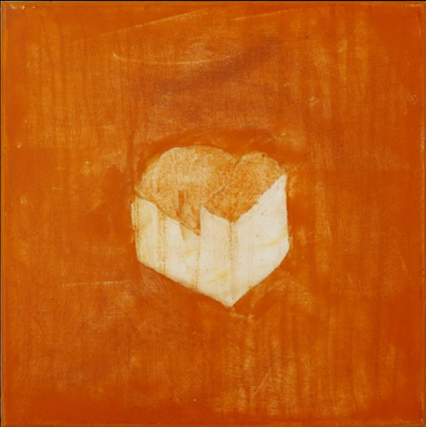
Denise Green
Capital Flower (#2), 2006
Acrylic on canvas, 14 x 14
Gift of Francis X. Claps M.D.
I chose this piece because I was looking for a work that takes on new meaning in our current context. This painting struck me with its quietness and simplicity. It’s just over 1 foot by 1 foot, but it’s also a part of a series of similar paintings with simple, isolated shapes surrounded by color fields. On the artist’s website they are displayed serially in a vertical orientation. There’s an interesting contrast between the geometry of the structure in the center with the organic nature of the thin washes of color and warm orange hue.
It feels like it could be about the state of being alone, but not necessarily loneliness; the colors feel too beautiful and awake to be talking about loneliness. Its more the feeling of being aware of yourself as a singular being, self-contained and independent, but also existing within a larger context. It certainly reminds me a lot of my current state of mind having been spending so much time alone. Of course there are times when I miss the company of others, but it’s kind of wonderful to just stew in yourself for a while, because then you can begin to identify where the world around you ends and where you begin.
-Sylvia Atwood ’22
BLACK LIVES MATTER

Students Respond: “Winking Mom”
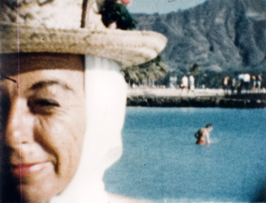
Larry Sultan
Winking Mom, 1984
Chromogenic color print, 17 x 21.25
Gift of Jeanne Press and Richard S. Press ’60, P’ 90, P’08, P’12
This piece caught my eye by the dramatic contrasts in scale (between the woman up front and the figure in the back), not to mention the energy of a captured gesture in the wrinkles and expression of the lady’s face. But what kept pulling me in from an initial pause was the relationship between the lady, the small figure, and the title, which read like tension to me. The composition of the piece, beautifully pleasing with lines and subjects arranged along thirds, in many ways centers the figure in the back–the eye wants to go there to rest even as the lady’s face is the largest.
In this way, as a viewer I’m left wondering and imagining a story between the photographer, the mom, and this figure. Was there an intention to capture this figure, the winking a nod of more story and a secret between them about this person, with this person? And before the title, the wink also can read like a squint, perhaps trying to make sense of this figure too, but facing us, facing the wrong way. Suddenly, now as a viewer, we become part of this circle, we are the one’s winked at, squinted at, a stranger brought into an unknown story and tasked with speculating. The tension I mentioned, then arises from my focus as viewer on the figure in the back and the title’s focus on the mother’s wink. Is it a clue, hinting there’s more to the story? Or is my focus misplaced? And this is exactly what I find so fascinating about the piece: it makes me question intimacy–the intimacy between photographer and subject, viewer and subject, and even strangers (or maybe not?) crossing paths at a lake. It seems to beg the question to me, what is the intimacy that can be imagined, or perhaps always there, between strangers? And it also highlights to me the photo’s/artist’s, power to manipulate and recast intimacy that is always possible, so perhaps always there, to varying degrees.
-Victoria Xu ’21
Students Respond: “John Mollenkopf”
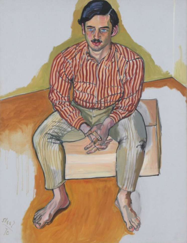
Alice Neel
John Mollenkopf, 1970
Oil on canvas, 52 x 39.75
Gift of Dr. Hartley Neel
I picked this painting because it was one of the few portraits in the gallery’s paintings collection and I’m really interested in portraiture and figure painting (especially work that breaks portraiture conventions). I think I was immediately drawn to Neel’s powerful use of line: the thick black outlines denoting form, the bold vertical motion of the figure’s shirt and pants, and the harsh shadows on his feet and forehead. The contrast between the severity of the brushstrokes and the sitter’s relaxed, almost vulnerable posture and serene expression lend the painting a powerful psychological depth. As I researched Neel a little more I found that in her portraits she aimed for truthful depictions of her sitters rather than realistic portraits; I think this painting is a subtle but successful example of that goal. The subject is also clearly situated in a space, but the painting holds no clues as to what or where the space is; I think this raises interesting questions about the relationship between Neel and this sitter particularly (presumably John Mollenkopf) and more broadly about how the intimacy (or lack thereof) between a painter and a sitter/model can shape a painting.
Ann Temkin wrote of Neel’s work that it was “happy to look wrong,” which I really like as an idea and I think is part of what drew me to this painting. In the figurative work I’ve been doing I think I’ve been trying to achieve something similar (although I didn’t have those words to describe it yet), so I’m really excited to study Neel’s work more thoroughly and learn from her.
-Magdalena Levandoski ’22
Students Respond: “No Skeleton for Evsa”
Joan Snyder
No Skeleton for Evsa, 1971
Oil, acrylic and spray enamel on canvas, 78 x 108
Gift of Elizabeth Gibbons Rauh in memory of Nancy Duke Lewis
I really enjoy looking at this piece for a variety of reasons, but I think what draws me to it most is despite its abstraction and physical flatness, I get a strong sense of time, dimension, and emotion (through the motion and power used in the strokes, the color, and variety of media used). Joan Snyder explicitly uses the grid in a lot of her pieces and I feel an implicit usage of that grid in this piece too—in the verticality of the drips but also those short sets of horizontal lines in the background. I personally see it as a grid because those two elements in a way set the piece, hold the piece, and give it dimension—those lines, for me, act as a background onto which the rest of the piece is held.
Both the colors and stroke reveal emotion and motion, and emotion through motion. Just looking at the colors, her palette choice makes this piece a saga. There’s happiness in the vibrant purples and greens, triumph in the golds, pain and anguish in the reds and browns and the stains that drip down, there’s sorrow in the cool blue tones and the blurriness that encases it, and a feeling of redemption and resolution in the stark white. And she places the strokes in a way where it’s not a saga with a timeline, all these emotions and feelings hit at once at first view. Finally, looking at the strokes, her placement and physical force used in painting them give a sense of conversation and reaction. There are some strokes that encompass another set and there are some strokes that look like they’re “attacking” a rival group of strokes. The residual drips that stem from the strokes and their differences, whether it flows down heavily or drizzles below the stroke, tells how Snyder painted that stroke—the speed of the stroke, the paint on the brush, and the emotion and the thought in which she painted it. All of Snyder’s elements create a painting that is a dynamic, evocative, narrative blistering with emotion and only through strokes a collection of relatively short length.
-Annie Jacob ’21
Students Respond: “Circus”
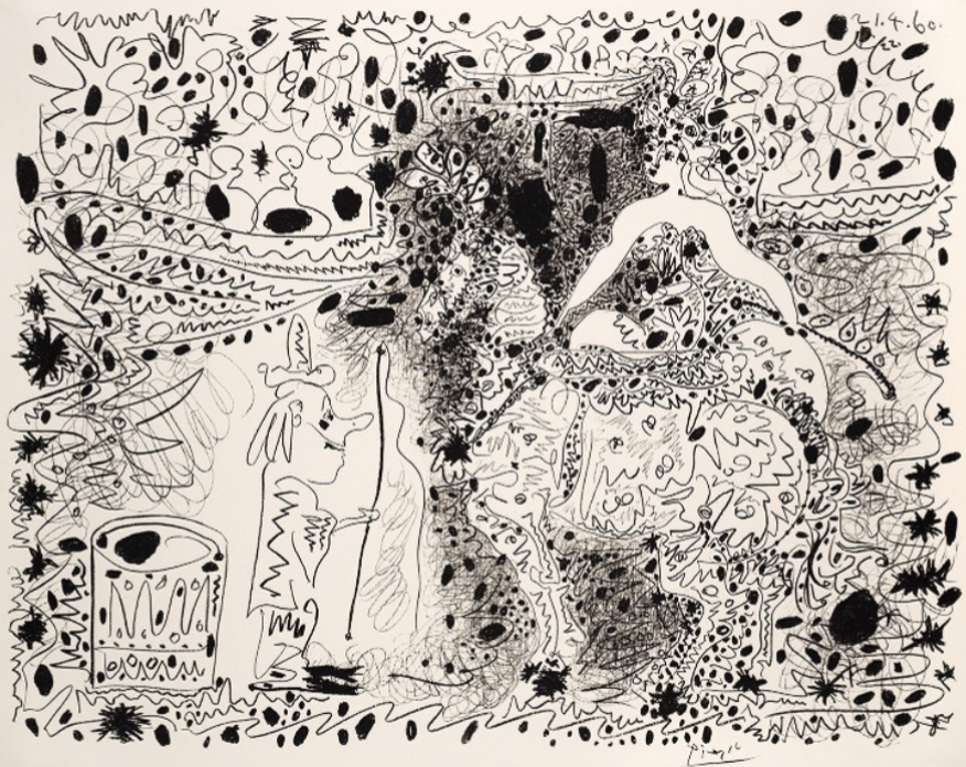
Pablo Picasso
Circus, 1899
Lithograph, 22.5625 x 27.125
I chose Pablo Picasso’s print Circus, made in 1960, from the Bell Gallery collection. I chose this piece because I’m interested in how artists create the essence of patterns without following traditional aspects of design such as symmetry, linear placement, or uniform shape. Instead, Picasso has created an overall sense of unity while also utilizing ambiguity in his mark-making. As a result, the piece stays interesting regardless of where you are looking or whether you recognize the forms of the horse, the audience, and the ringleader. The continuous line work guides the eye through the scene and captures the frenetic but exciting nature of the circus, a theme common in Picasso’s works. As a painter, I appreciate the print for what it can teach me about fluidity, pattern, and atmosphere moving forward.
-Jazzmin Cox-Caceres ’23
Students Respond: “Untitled”
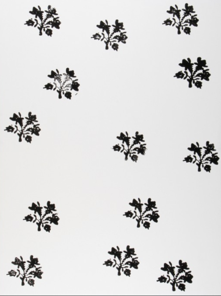
Christopher Wool
Untitled, 1988
Alkyd and flashe on aluminum, 96 x 72
Gift of Mr. and Mrs. Ronald Ostrow
I chose this piece because I’m interested in its clarity and simplicity. I am really fascinated by neat decorative patterns in paintings and usually draw on them in my own work to fill backgrounds and empty spaces. I like how here it operates as the entire work. I think it brings attention to decorative art in a pleasing and successful way.
Although I am not extremely familiar with Wool’s work, I notice that this work and a few others from the same period are a bit unusual for him, as they highlight repeated motifs that could be read as purely “idyllic” or “pretty”. Typically, he works more conceptually with an emphasis on language and more abstract imagery. This suggests to me that this work “Untitled” offers more than meets the eye. The “niceness” gives way to the harshness of its colors, materiality, and the irregularities of the composition. The flowers themselves, if they are flowers at all, are absurd and contain sharp points. Wool points to the complexity and seriousness for which decorative patterns are often, wrongly, not credited.
-Elizabeth Toledano ’20
